




I’m currently working on a complex manual regarding a marine electrical system. This particular manual has many similarities to three other manuals I have done in the past, but it’s not exactly like any one of them. When I’m working on a project like this, I find it helpful to keep several of the previous documents open for reference. But since all the documents look so much alike, there have been times when I’ve lost track of which one was my “working” document, and I ended up editing the wrong one.
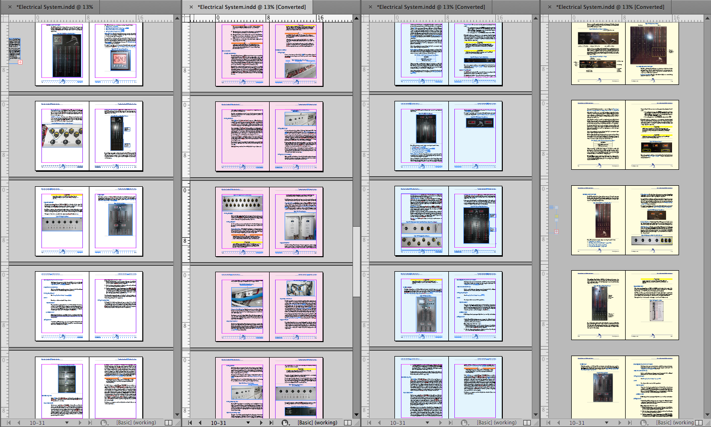
But today I came up with a way to distinguish between the working document and the reference documents. I simply change the CMYK values of thePaper color swatch. (To do this, double-click on the Paper swatch in the Swatches panel.)
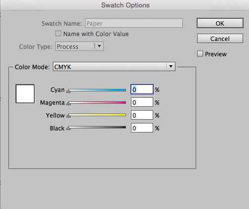
Paper: White
I edited the Paper swatch for each of the three reference documents, making them appear blue, pink, and yellow onscreen.
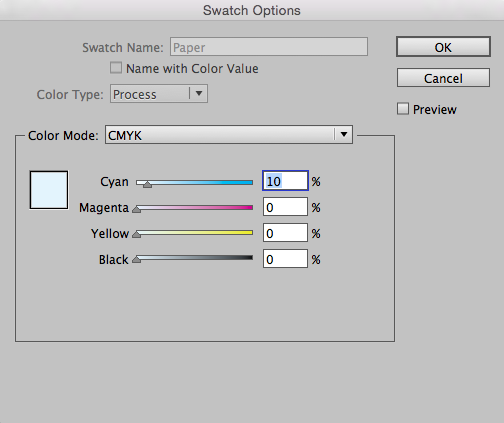
Paper: Blue
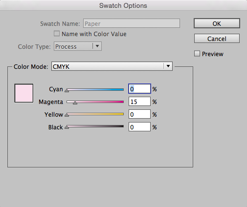
Paper: Pink
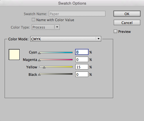
Paper: Yellow
Now, when I toggle between the three documents, I’ll never mistake any of them for my working document.
This article was last modified on July 25, 2019
This article was first published on August 21, 2017
Commenting is easier and faster when you're logged in!

Recommended for you
Create a Pantone Swatch in Illustrator
Make your own Pantone Swatch colors in Illustrator with Theresa Jackson.
Recolor Images Using Extracted Color Themes in InDesign
How to unify a design composed of separate placed images by recoloring them with...

How to Extract Colors from an Image in InDesign
Learn how to pull colors from an image in InDesign, make adjustments, then save...