


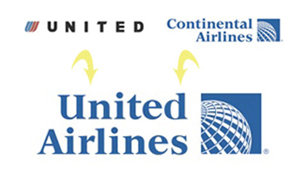
United and Continental Airlines recently announced a merger of the two companies. The new name is “United Airlines”. The new logo is this:
As you can see, while the first word in the name is still “United,” all other visual vestiges of United have disappeared.
What do you think of the new logo? Is it a successful mash-up, or just a mish-mash? Reply in the Comments.
For a bit of history on the design legacy of both companies, see Alissa Walker’s article “The New United-Continental Logo: Flying a Little Too Close Together.”
This article was last modified on August 13, 2021
This article was first published on May 6, 2010
Commenting is easier and faster when you're logged in!

Recommended for you
Before&After: Design From a Creative Brief
To know if you’ve reached a design goal, you must first know what the goal is. T...
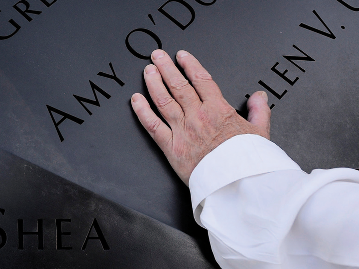
Before&After: Optima: The Typeface of 9/11
How Optima brings dignity and humanity to the National September 11th Memorial.

Before&After: How to Use that Typeface
That font you just learned about won’t work just anywhere; it has a style that n...