


TypeTalk is a regular blog on typography. Post your questions and comments by clicking on the Comments icon above. If Ilene answers your question in the blog, you’ll receive one Official development.creativepro.com T-Shirt!
Q. I’ve heard the term Roman used in reference to typefaces. What does it mean?
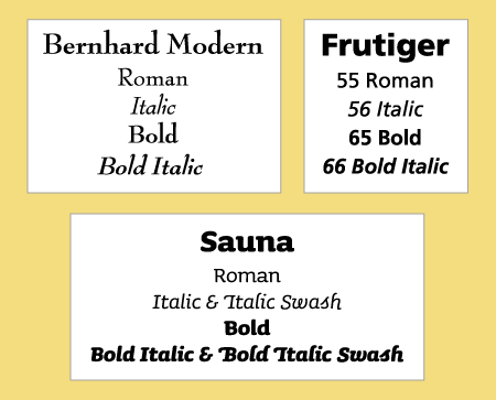
A. Today, the term Roman most commonly indicates an upright typeface, or an upright version of a member of a type family, as opposed to slanted typefaces and italic or oblique weights, which are cursive. Examples of this are Mark Simonson’s Felt Tip Roman and Letraset Bordeaux Roman, where Roman is part of the name and indicates an upright version, and Bernhard Modern Roman, Underware’s Sauna Roman, and Linotype Frutiger Roman, where Roman is used it indicate an upright weight.
Figure 1.Two examples of typefaces with the word Roman in their names, indicating an upright design.
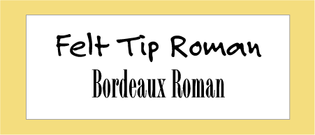
Figure 2.These type families use the designation Roman to indicate an upright book weight. (Not all weights shown.)
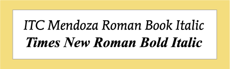
The exception to this rule (and a confusing one at that) is when the term Roman is part of the actual name of the font, such as ITC Mendoza Roman and Times New Roman, and whose cursive versions are indicated with the term Italic following Roman, such as Mendoza Roman Book Italic and Times Roman Italic. In these cases, Roman is referring to the more traditional meaning of the word, which describes serif typefaces of the early Italian Renaissance.
Figure 3. The word Roman in these typeface names (ITC Mendoza Roman and Times New Roman) indicates a serif design, not an upright one as in the previous examples.
Love type? Want to know more? Ilene Strizver conducts her acclaimed Gourmet Typography workshops internationally. For more information on attending one or bringing it to your company, organization, or school, go to her site, call The Type Studio at 203-227-5929, or email Ilene at info@thetypestudio.com. Sign up for her e-newsletter at www.thetypestudio.com.
This article was last modified on January 8, 2022
This article was first published on May 22, 2008
Commenting is easier and faster when you're logged in!

Recommended for you
Before&After: Optima: The Typeface of 9/11
How Optima brings dignity and humanity to the National September 11th Memorial.

Before&After: Design From a Creative Brief
To know if you’ve reached a design goal, you must first know what the goal is. T...
Before&After: How to Use that Typeface
That font you just learned about won’t work just anywhere; it has a style that n...