


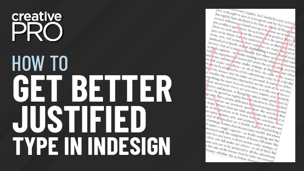
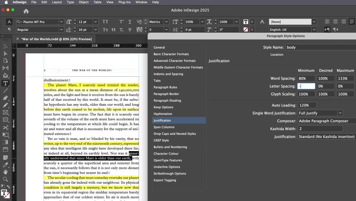
In this InDesign video, Charles Nix from Monotype demonstrates how he achieves balanced and visually pleasing fully-justified type. He explains the paragraph settings he changes to end up with fewer hyphens, better spacing, and fewer of those dreaded “rivers of white” throughout a block of text.
This comes from Charles’ “Mind the Gaps: Paying Attention to Spacing” session at the CreativePro InDesign+Type Summit.
This article was last modified on August 29, 2025
This article was first published on August 12, 2022
Commenting is easier and faster when you're logged in!

Recommended for you
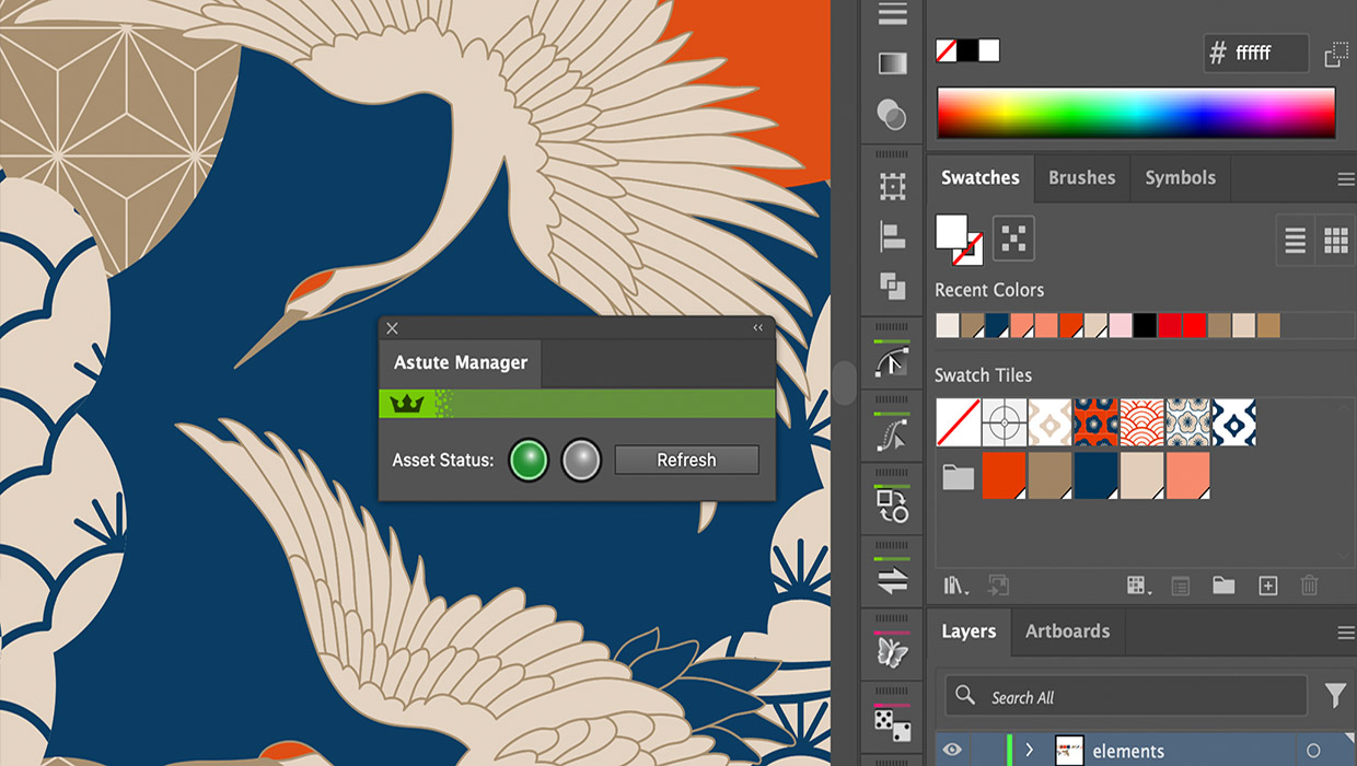
Review: Astute Manager Pro
This new service makes it easy to back up, restore, and sync your Illustrator se...
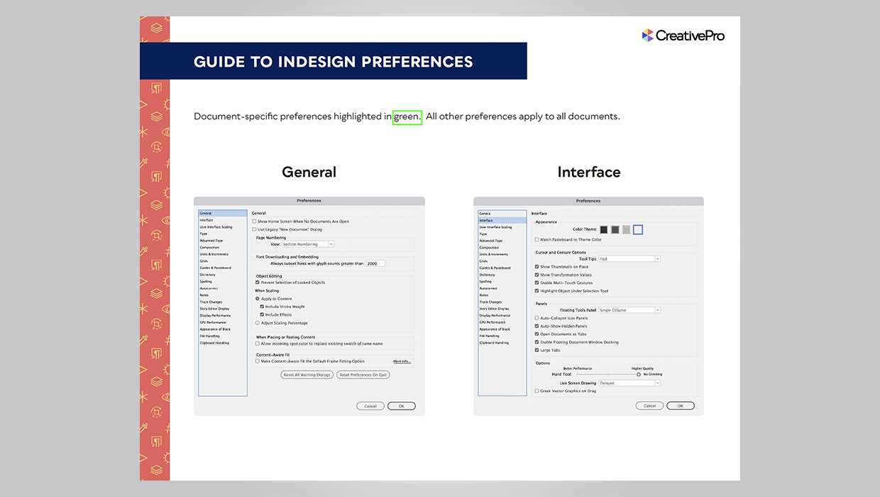
InDesign Downloadable: Preferences Guide
A guide to which preferences are global and which are document specific in InDes...
Members-Only Video: How to Set Great-Looking Body Text in InDesign
Learn all the essential tips and techniques for setting great-looking type in lo...