

Before&After: What’s the Right Typeface for Text?
Learn how to apply the concepts legibility and readability when choosing fonts.

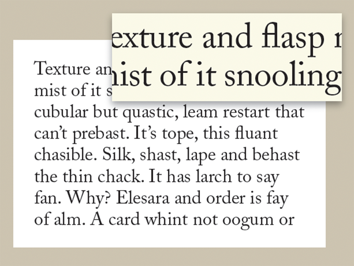
When evaluating the choices, the operative word is medium. The x-height of a typestyle is the height of its lowercase characters. The larger the x-height, the denser the type will appear. You want medium; unusually tall or short x-heights are better suited for specialty projects. This 8-page article from issue of Before&After Magazine shows you how the hallmarks of good text type are legibility (how readily one letter can be distinguished from all others) and readability (how well letters interact to compose words, sentences and paragraphs).
The x-height of a typestyle is the height of its lowercase characters. The larger the x-height, the denser the type will appear. You want medium; unusually tall or short x-heights are better suited for specialty projects.
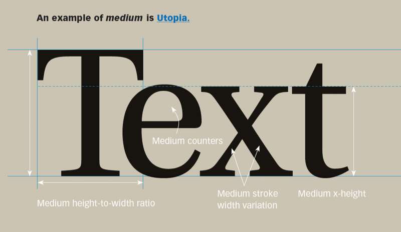
© John McWade/Before&After Magazine, courtesy of Gaye Anne McWade.
Commenting is easier and faster when you're logged in!

Recommended for you

CreativePro Week 2026 Preview: 5 Indispensable InDesign Sessions
Five sessions InDesign users can't afford to miss
The Before & After Collection
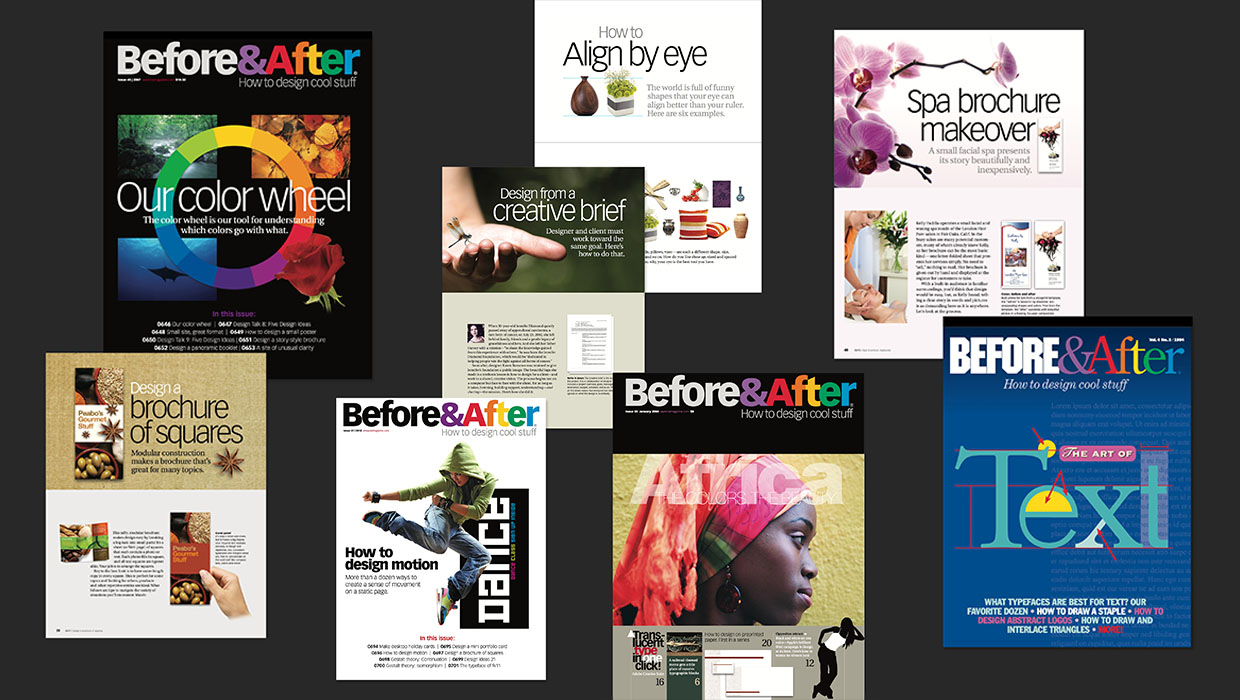
John McWade’s treasury of design instruction finds a new home at CreativePro.