


Before&After: How to Design Big Signs
Treat a big sign the same as you would a tiny one.

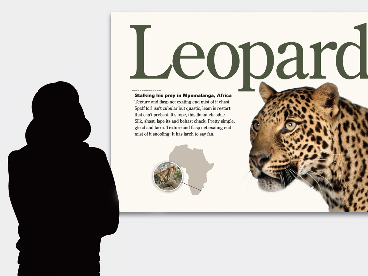
Big signs are everywhere—along freeways, on storefronts, at trade shows, in museums—but no matter how big they are, they share a paradox: At normal viewing distance, they appear small. The key to good design, therefore, is to treat a big sign the same as a tiny one. This 16-page article from issue 50 of Before&After Magazine shows you that the key to designing big is to think small, whether you’re making trade-show banners, billboards, wayfinding signs or wall posters.
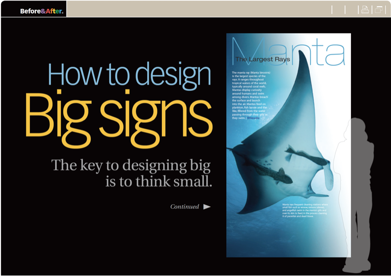
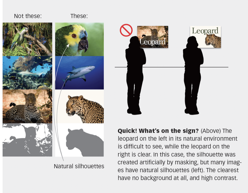
The key is to use one image, few words, simple typefaces, no overlaps (because you need clear silhouettes)—all to keep your design simple.
© John McWade/Before&After Magazine, courtesy of Gaye Anne McWade.
Commenting is easier and faster when you're logged in!

Recommended for you

How to Be a Better Designer: Step Away from the Computer!
Look away from the screen to find yourself as a designer
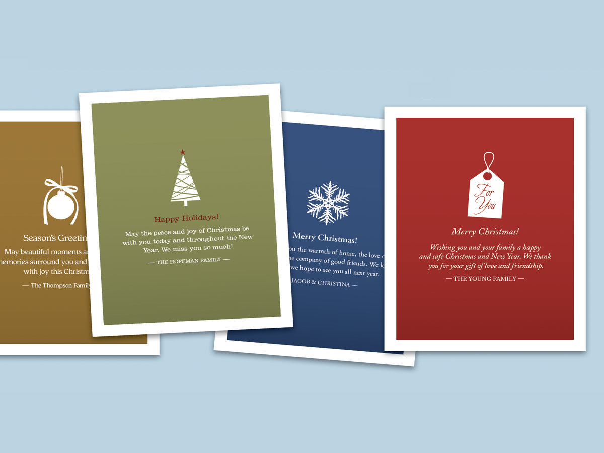
Before&After: Make Desktop Holiday Cards
If you need to make your own quick and easy holiday card, this one fits the bill...

Interview with Thaddeus Coates, Artist and Character Designer
Thaddeus Coates shares his fun and fearless approach to design and how community...