


Before&After: Design Without Rulers
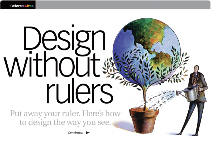
Put away your ruler; here’s how to design the way you see!

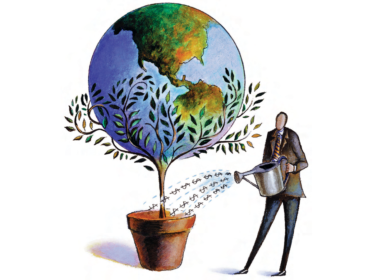
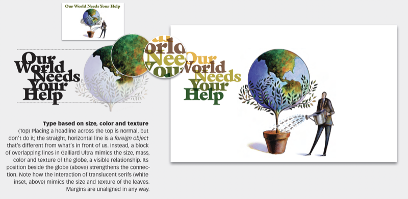
We need a typeface that feels like the image. The image is full of texture; it has a rich, detailed surface and a lot of “leafy-ness.” The leaves are pointy, evenly spaced and actually look a lot like serif type. This 21-page article from issue 47 of Before&After Magazine takes you along as we design a page—not with a grid, but with a picture as our visual guide. Its lines, shapes, proportions and their relationships will govern our choice of type, sizes, colors, layout and everything else.
Color plays a major role in design. The easiest and best place to get a perfectly coordinated palette is the image itself. Sample color swatches with the eyedropper tool, then arrange the swatches by color and value.
© John McWade/Before&After Magazine, courtesy of Gaye Anne McWade.
Commenting is easier and faster when you're logged in!

Recommended for you

Before&After: Draw Great Visual Instructions
Have something to demonstrate or explain? Don’t say it; show it!

Before&After: How to Use that Typeface
That font you just learned about won’t work just anywhere; it has a style that n...
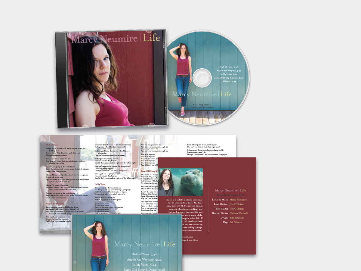
Before&After: Design a CD/DVD Package
We redesign a CD package to make it look as good as the music sounds.