



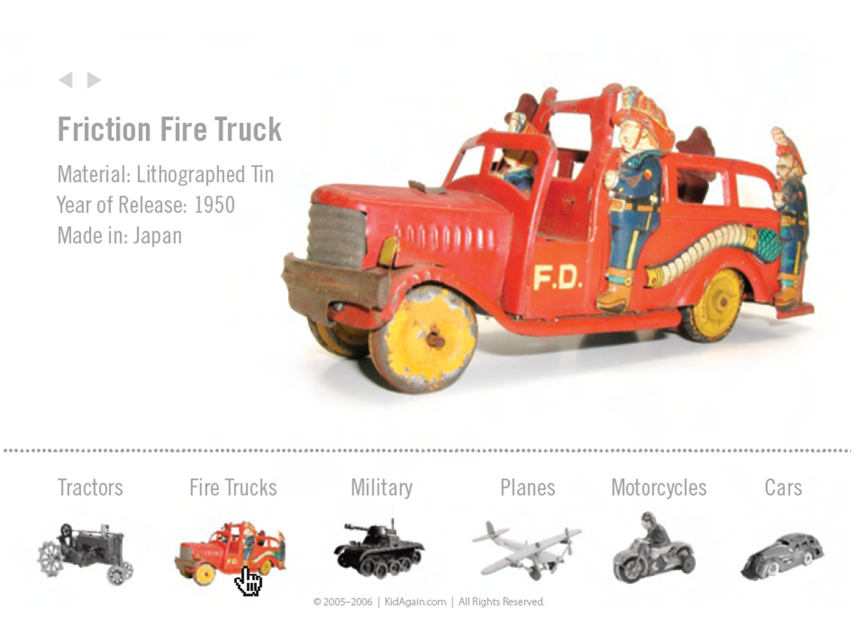
Here’s a quick design tip on using color in web design from issue 42 of Before&After Magazine.
A colorful object in a field of black and white is an easy way to signify an active link.
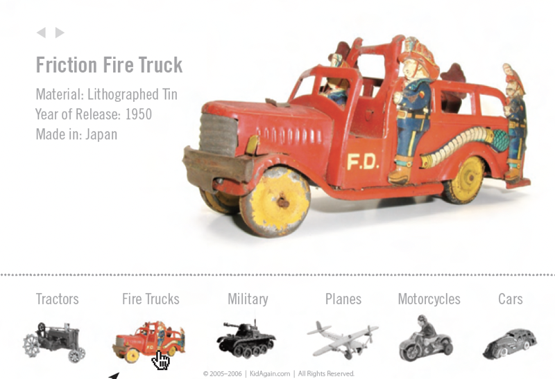
It’s great for portfolio-style sites and especially suitable when the images are from an era of black-and-white photography.
CreativePro members can download original content from Before&After Magazine, a beloved resource that taught a generation of newly minted digital designers how to design and communicate effectively with the written word. See our archive here.
© John McWade/Before&After Magazine, courtesy of Gaye Anne McWade.
This article was last modified on January 3, 2026
This article was first published on January 31, 2025
Commenting is easier and faster when you're logged in!

Recommended for you

Before&After: How to Align Images by Eye
How do you line up irrregularly shaped objects and size and space them just so?
Before&After: Design a Card the Easy Way
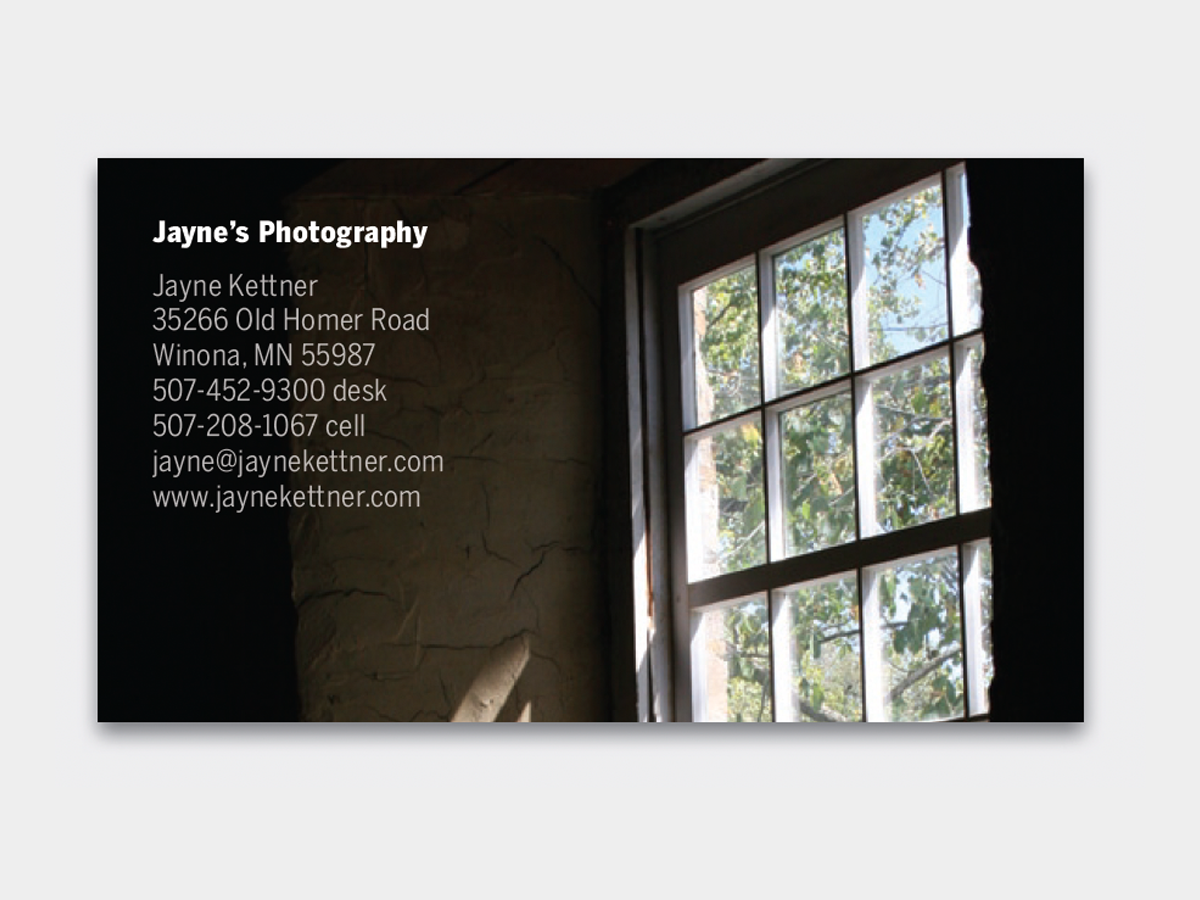
A photo and one block of type are all it takes to make a beautiful business card...

Before&After: Gestalt Theory: Continuation
Learn how to use Gestalt theory to explain visual connections.