




Here’s a quick design tip on signage design from issue 41 of Before&After Magazine.
This signage’s serene beauty is the result of its graphical similarities; you use only a few different elements—color, shape, line, space—and repeat them.

The similarities, like twins, naturally harmonize. Have a look:

Repeat the color: The tiny dot is all you need to connect top to bottom. Cover it up and see.
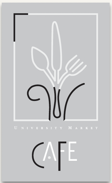
Repeat the shapes
Repeat the line

Repeat the space
CreativePro members can download original content from Before&After Magazine, a beloved resource that taught a generation of newly minted digital designers how to design and communicate effectively with the written word. See our archive here.
© John McWade/Before&After Magazine, courtesy of Gaye Anne McWade.
This article was last modified on December 17, 2025
This article was first published on July 11, 2025
Commenting is easier and faster when you're logged in!

Recommended for you
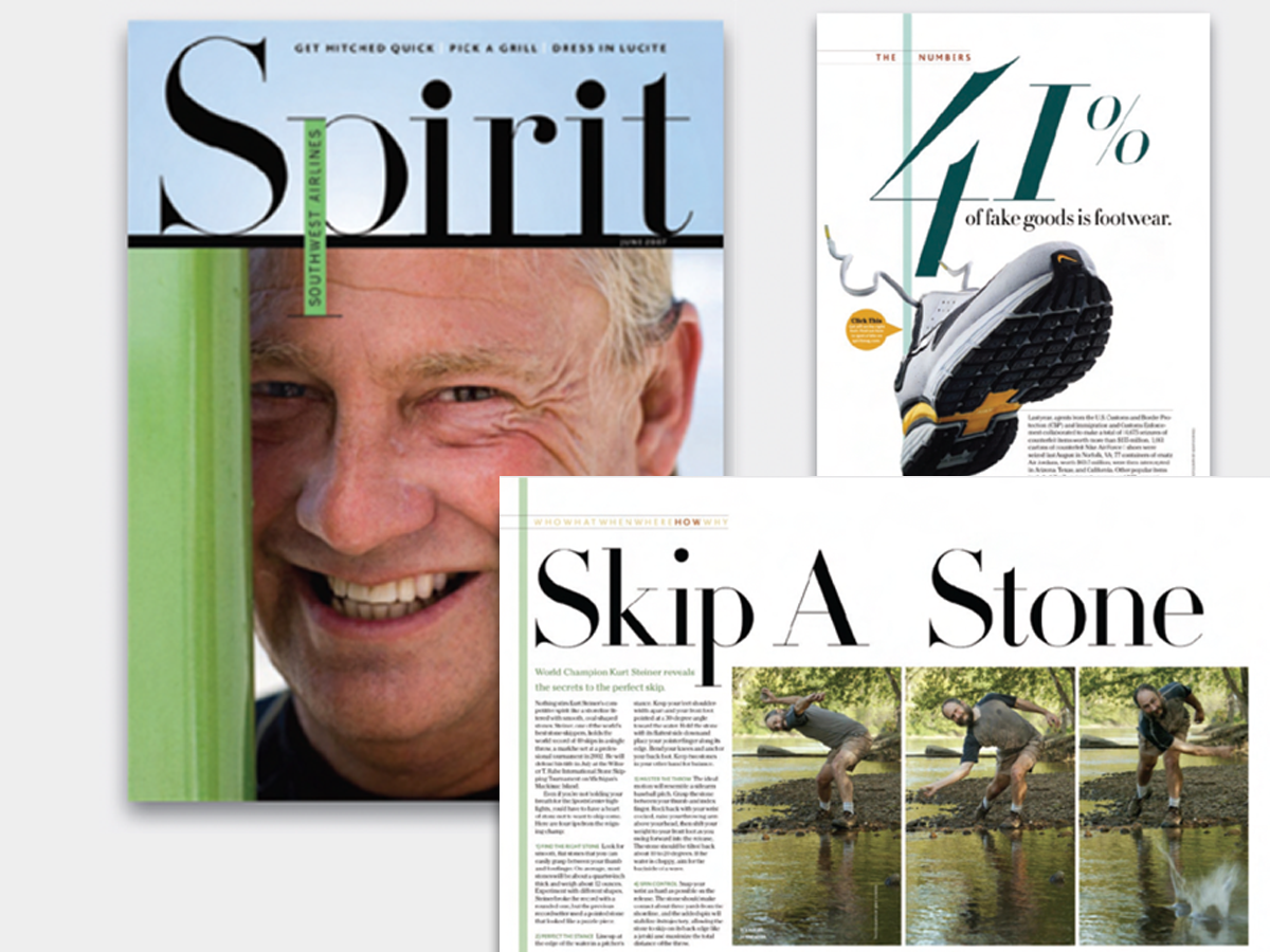
Before&After: Big, Bold, Beautiful
This magazine is a quick read for the busy traveler. Here are the techniques tha...

Before&After: Gestalt Theory: Continuation
Learn how to use Gestalt theory to explain visual connections.
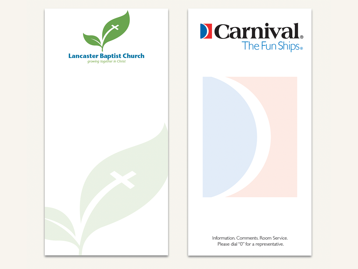
Before&After Design Tip: Use a Ghosted Logo to Make a Great Notepad
This small notepad shows off your logo and lets your reader interact with it slo...