


Before&After: Design a Letterhead, Envelope, and Business Card
How to turn letterhead, envelope, and business card into a single visual presence.


These three most common business documents are always designed as a package, yet they differ greatly in size and have very different proportions. Yet these documents must look and feel the same. The key is to establish rational and repetitive visual relationships between mark, type, and the spaces they occupy. This 16-page article from issue 40 of Before&After Magazine shows you how to turn a letterhead, an envelope, and a business card into a single visual presence.
The key will be to focus on the logo, not the funny proportions of these three oddball formats.
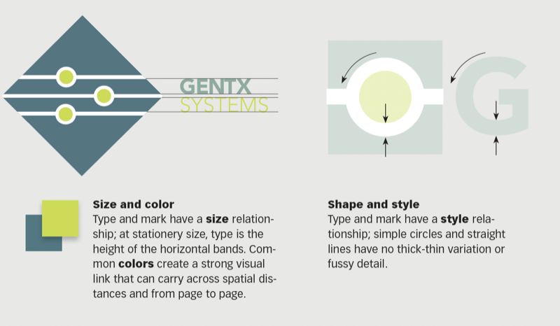
© John McWade/Before&After Magazine, courtesy of Gaye Anne McWade.
Commenting is easier and faster when you're logged in!

Recommended for you
Before&After: Presentation Lessons from Apple
Timeless lessons from Apple on crafting a perfect presentation

Before&After: How to Set a Text-Only Logotype
The key to a great logotype is to find a typeface that makes the name look good...
Before&After: Gestalt Theory: Equilibrium
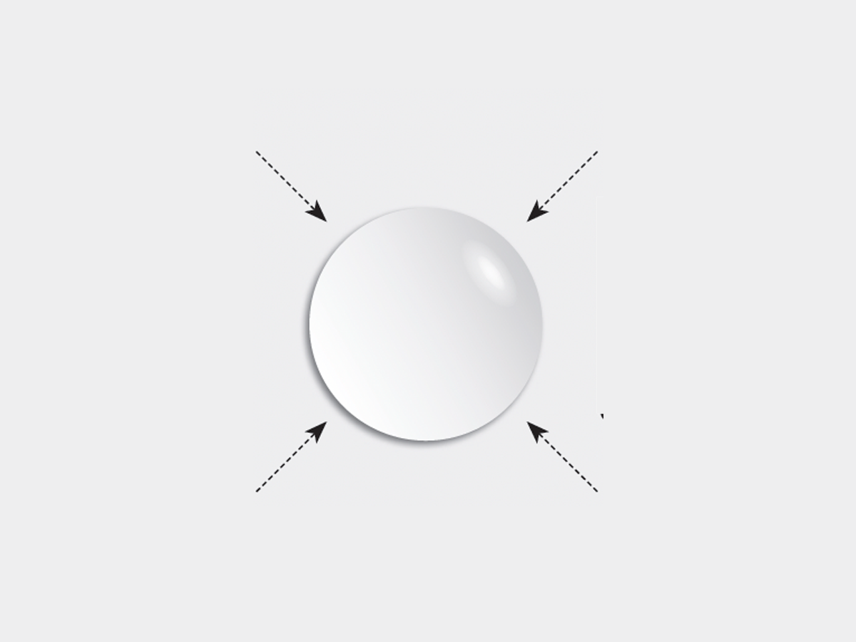
Equilibrium gives your design elements rest, stability, and permanence.