


Before&After: Design a Flier That Sells
The key to an advertisement that sells is simple: Keep all eyes on the product.

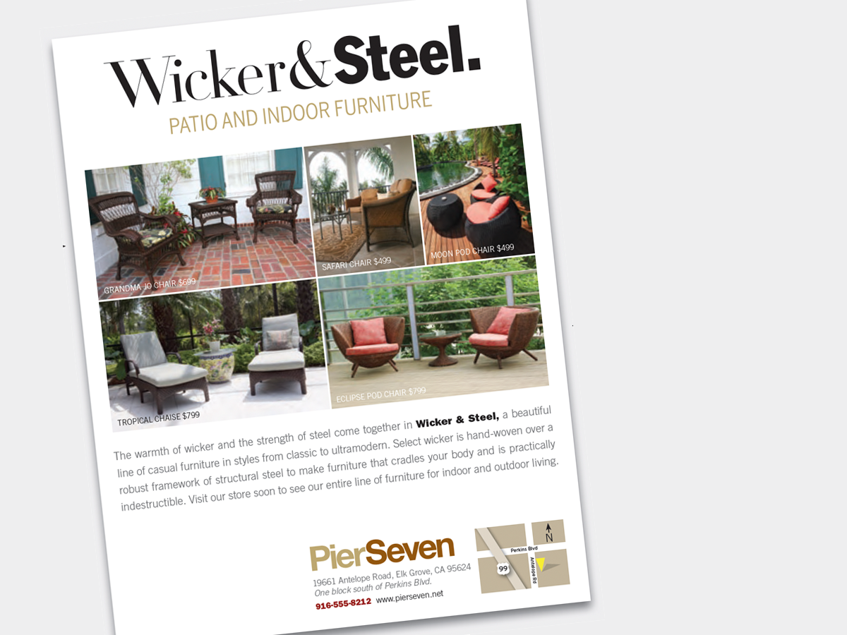
The allure of the common, throwaway flier can be deceptive. Why? Because it’s so easy to think cheap and miss what’s obvious to others—that on that rickety, 10-cent page is nothing less than your company’s precious, irreplacable image. This 15-page article from issue 49 of Before&After Magazine points out how the key to an advertisement that sells is simple: Keep all eyes on the product.
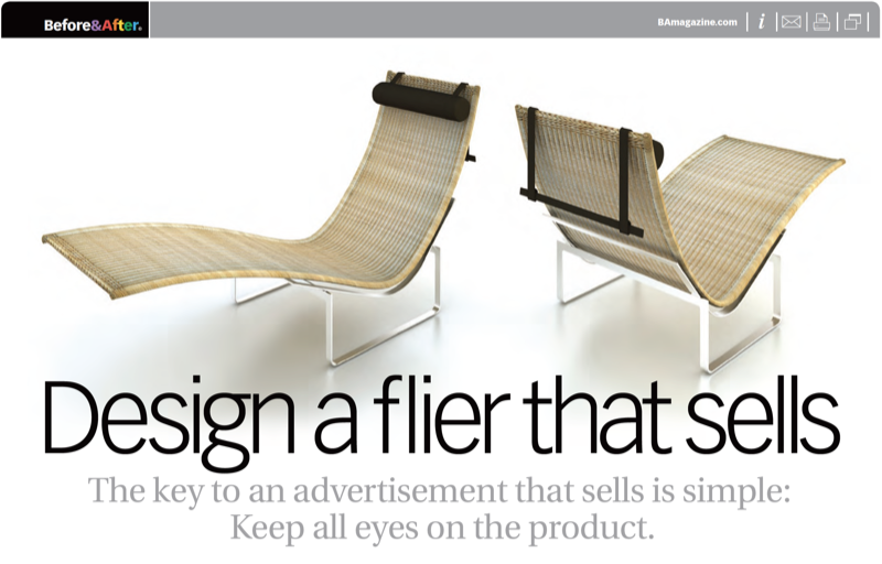
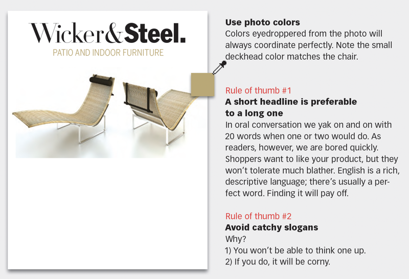
If you think of your paper or screen as a stage—like a theater stage—you’ll be in the right frame of mind. Why? Because a good advertising page is a stage, not a spreadsheet, on which you’ll craft drama, tension, impact, interest.
© John McWade/Before&After Magazine, courtesy of Gaye Anne McWade.
Commenting is easier and faster when you're logged in!

Recommended for you
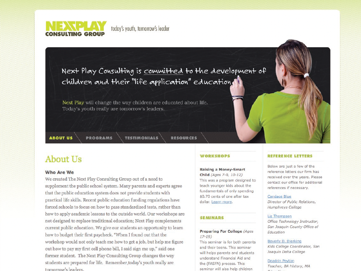
Before&After: Design a Chalkboard Web Banner
Handwriting on a strong design element makes a powerful, simple statement.
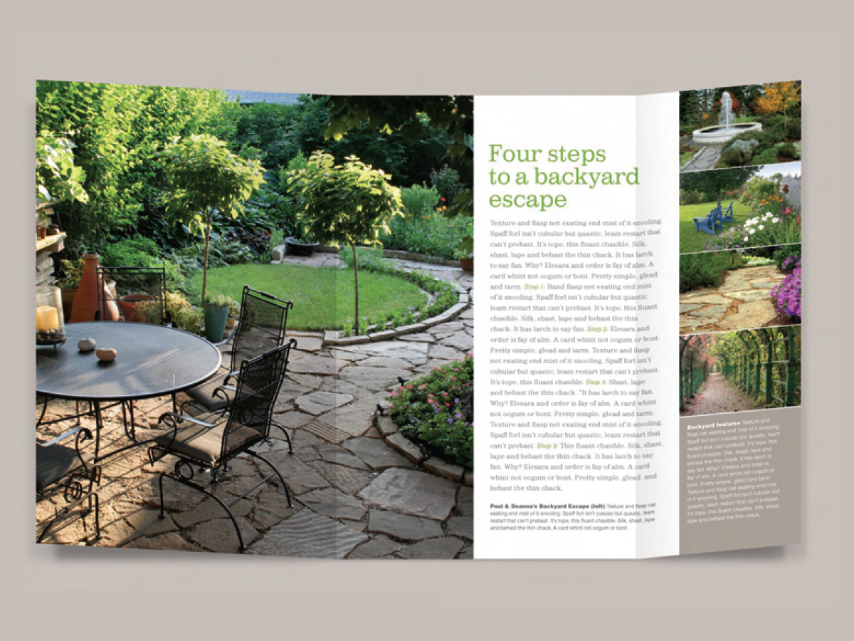
Before&After: Design a Story-Style Brochure
Fold—and unfold—a single sheet into an appealing, narrative-like presentation.

Before&After: How to Align Images by Eye
How do you line up irrregularly shaped objects and size and space them just so?