

Before&After: Design a CD/DVD Package
We redesign a CD package to make it look as good as the music sounds.

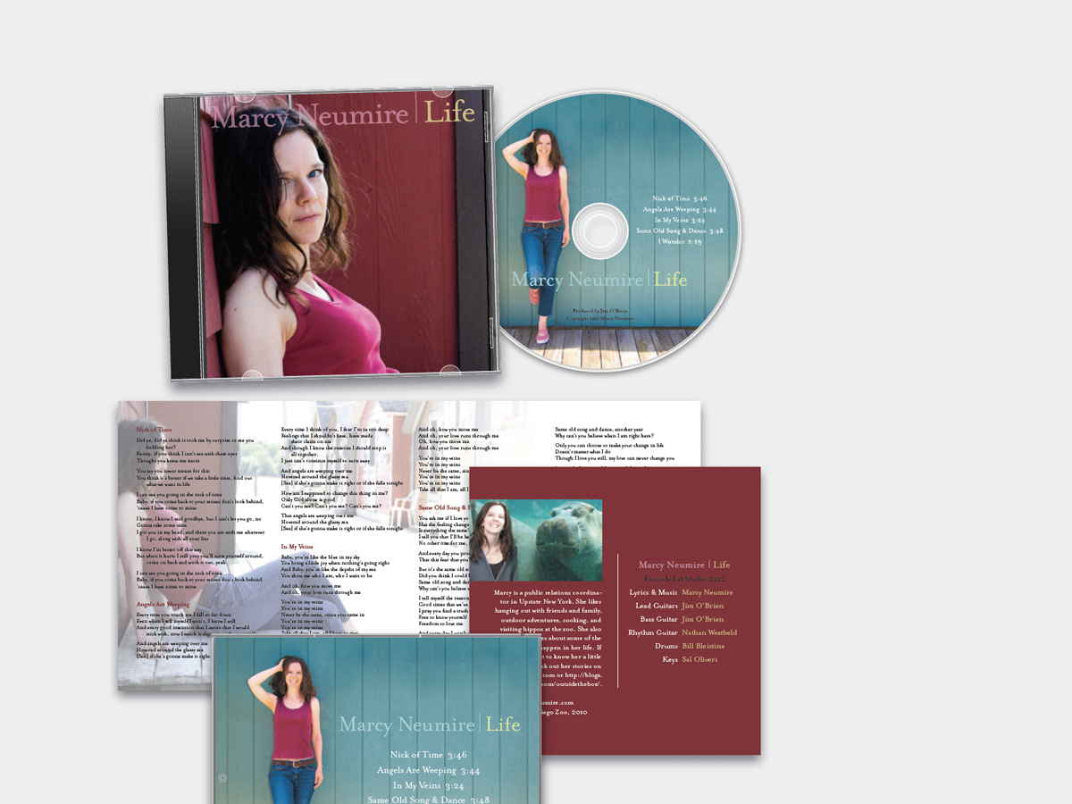
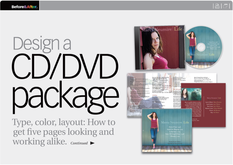
The ideal project is one in which client and designer work from the beginning to realize a common vision. But so many more projects are like this one, where the photos had already been taken; the course had already been set. So starting in the middle of the job, here are the changes we made, and why, to get this album looking as good as the artist’s music sounds. This 21-page article from issue 52 of Before&After Magazine takes us along on a redesign that uses type, color, layout to get five pages looking and working alike.
Two new photos, a pleasing, unpretentious typeface, and repetitive colors and layouts unify the design and convey Marcy’s simple style and music.
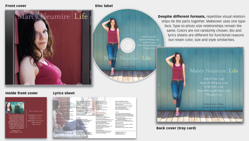
© John McWade/Before&After Magazine, courtesy of Gaye Anne McWade.
Commenting is easier and faster when you're logged in!

Recommended for you

Interview with Guillermo Flores Pacheco, Art Director and Illustrator
The artist behind the Photoshop splash screen shares his process and perspective...
Before&After: Design a Card the Easy Way
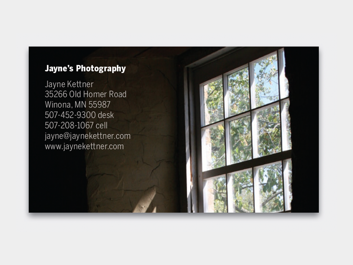
A photo and one block of type are all it takes to make a beautiful business card...

Before&After: Gestalt Theory: Similarity
Elements of similar shape, color, or other attribute can seem to belong together...