


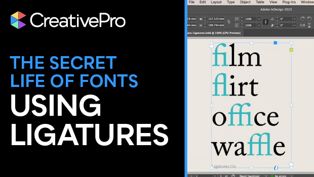
In this typographical how-to video, Nigel French talks about ligatures: when two characters are joined to create a single glyph. Ligatures make text look smoother and fix awkward spacing issues. InDesign turns on standard ligatures by default, but Nigel talks through how to use them or not use them more intentionally.
Subscribe to the CreativePro YouTube channel for more helpful design tips!
This article was last modified on October 3, 2025
This article was first published on October 3, 2025
Commenting is easier and faster when you're logged in!

Recommended for you
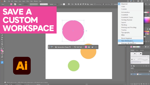
How to Make Illustrator More User Friendly
Set up your own custom workspace with Kat Kremser.
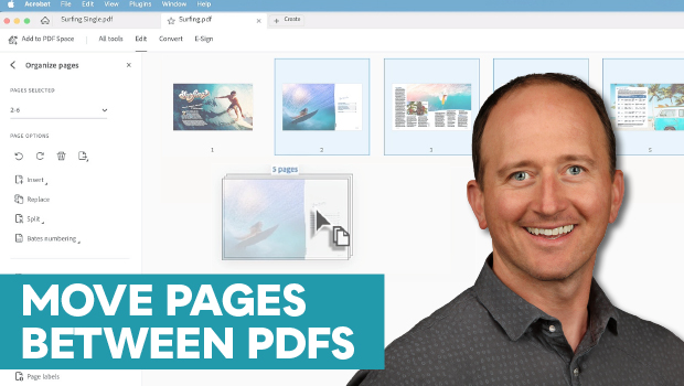
How to Move Pages Between PDFs with Adobe Acrobat
Learn how to move pages between PDF files with Chad Chelius.
Free Webinar: Animate Your Marketing Graphics with Photoshop
Learn how to create eye-catching animated GIFs, motion graphics, and simple vide...