


Before&After: Design a Card the Easy Way
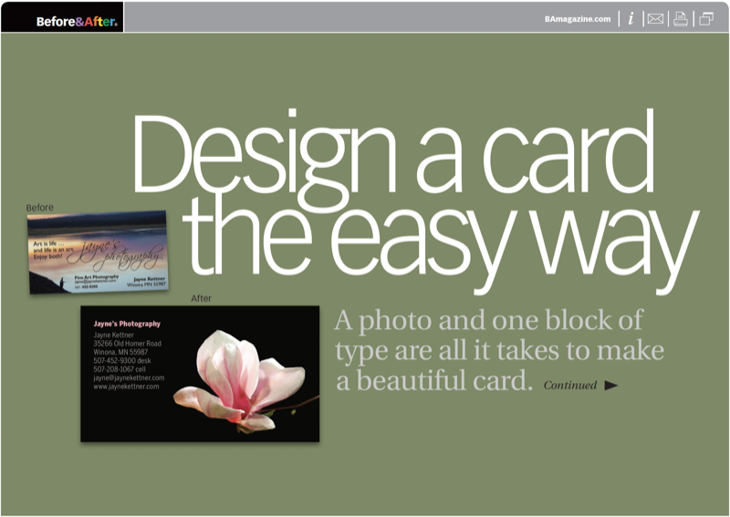
A photo and one block of type are all it takes to make a beautiful business card.

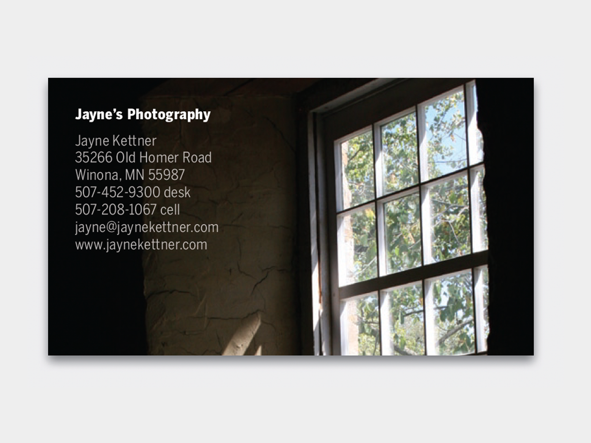
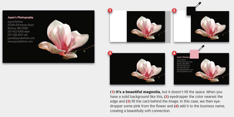
Set your words in a block of ordinary type—not fancy type—and place it in the upper-left corner. Place and crop your photo all the way to the edges. Color the type white, and you’re done. No artificial graphics, no distracting layouts. This 13-page article from issue 49 of Before&After Magazine poses the question: When this photographer’s images are rich, well composed, and pleasing, just what she’d want the world to see, why would she need a logo to convey her work?.
This design approach to a business card quietly places your work, literally, into the client’s hand, simply, clearly, beautifully.
© John McWade/Before&After Magazine, courtesy of Gaye Anne McWade.
Commenting is easier and faster when you're logged in!

Recommended for you
The Before & After Collection
John McWade’s treasury of design instruction finds a new home at CreativePro.

Before&After: Picture Your Group
Have a dozen or more mug shots? A grid of squares gets that gang of yours lookin...

Before&After: Optima: The Typeface of 9/11
How Optima brings dignity and humanity to the National September 11th Memorial.