

Before&After Case Study: UPS Branding
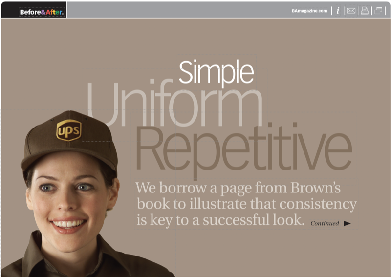
This 10-page article from issue 39 of Before&After Magazine lets you see how for UPS, the key to a successful look has been consistency.

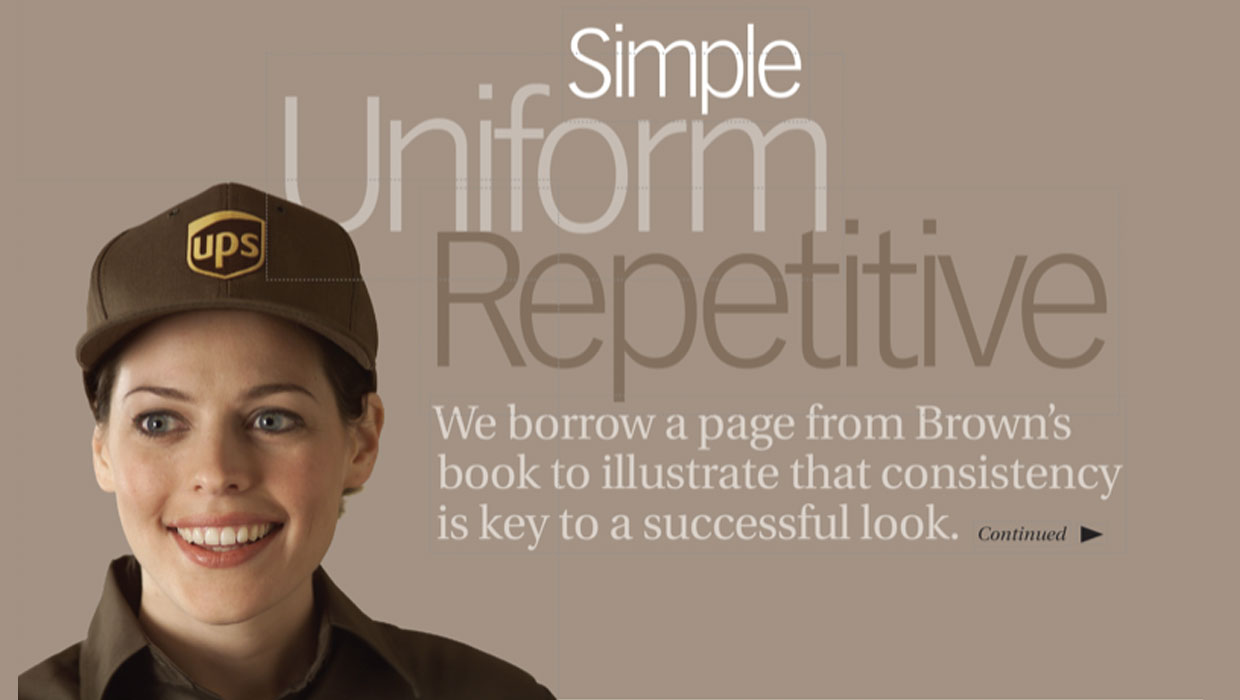
Once you’ve settled on a logo and related imagery, you must forever leave it alone. Don’t touch it. Repeat it exactly, over and over and over until you’re bored and beyond bored. The surprise is that’s what makes it strong! This 10-page article from issue 39 of Before&After Magazine lets you see how for UPS, the key to a successful look has been consistency.
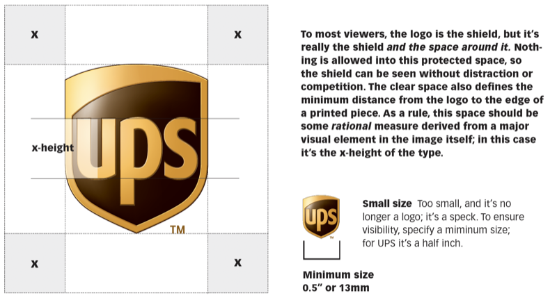
Your brand guidelines will ensure that the look and voice of your logo remain constant.
© John McWade/Before & After Magazine, courtesy of Gaye Anne McWade.
Downloadables are an exclusive benefit for CreativePro members! (Not a member yet? Join us and get $10 off with the discount code: DOWNLOAD)
Commenting is easier and faster when you're logged in!

Recommended for you

Before&After: Picture Your Group
Have a dozen or more mug shots? A grid of squares gets that gang of yours lookin...
Before&After: Design a Flier That Sells
The key to an advertisement that sells is simple: Keep all eyes on the product.
Before&After: How to Set a Text-Only Logotype
The key to a great logotype is to find a typeface that makes the name look good...